Have you ever found a perfect element for a layout and it doesn’t match the kit or photo you are working with?
CT Member Sheryl here with some tips and tricks about making it work. Recoloring an element isn’t as hard as you might think. Hopefully, this basic tutorial will open up a whole new world of mixing and matching elements, alphas and papers in your scrapbooks.
Where do you get started in this process?
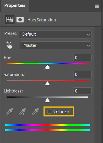
There are many different software programs out there for scrapbooking, but in general, most use the same process. Most recoloring actions can be done quickly by using the color or hue/saturation adjustment layer in your software. Once you select your item, you can change the color by adjusting both the hue and saturation sliders to get it in the color family you want. You can also play with the brightness to help it blend in the way you want.

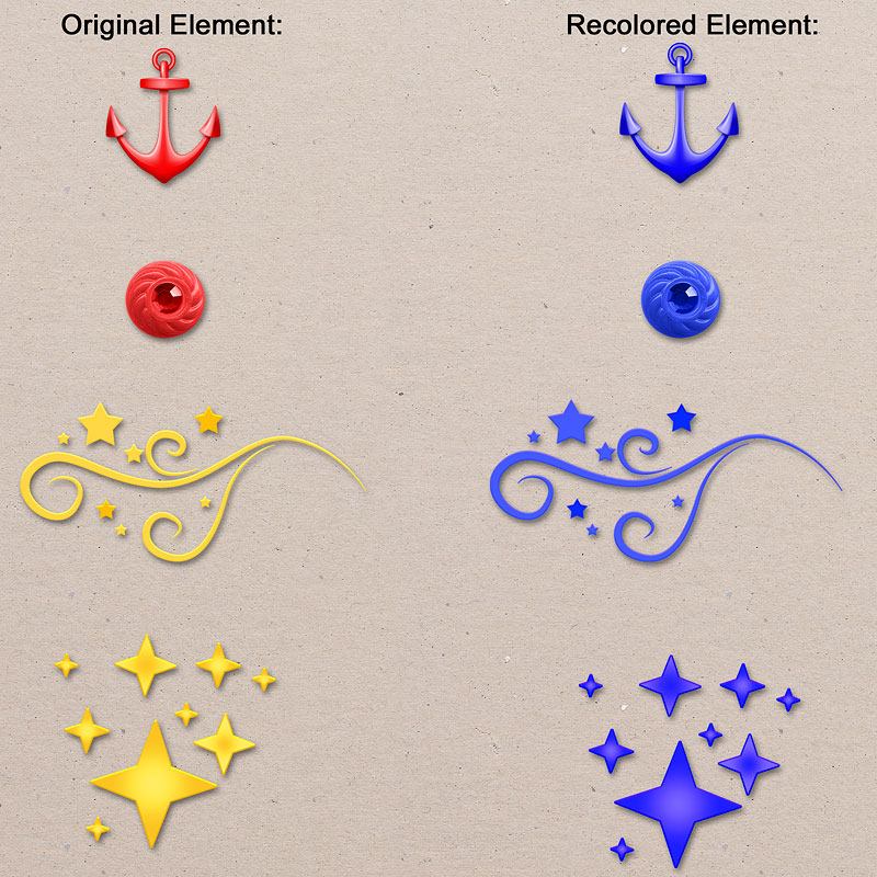
Let’s start with a simple example of an element with just one color, and then move on to a more complex example. Here’s a few elements where I changed the original element color to blue by simply adjusting the hue slider.


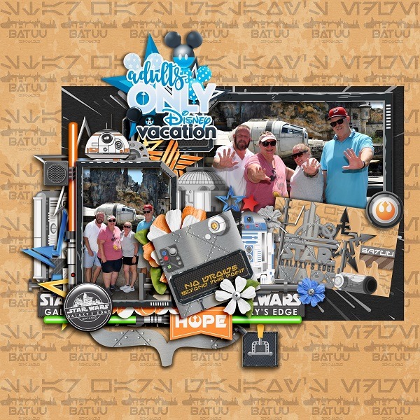
Now let’s move on to another more complex example. I was working on a page from Kelly’s Discover Batuu collection
I was pretty happy with the page, but wanted a bigger title that related to the trip we took with our friends. I found the perfect word art in Title It! Occasions Adults Only Word Art except the colors didn’t match my color scheme.
I use Artisan software. I adjusted my hue to match the blue elements in the Discover Batuu kit and the shirt my friend was wearing. I then played with the brightness and saturation. I also used a setting in my software called color balance. Here is my finished page.

Pretty cool, right? But look closely at the recolored word art title. The original colors contained red, yellow, black, and white. Why didn’t the black balloons and the black word “vacation” get colored blue? And why didn’t the white outline around all the wording get colored blue?
The colors black and white have no hue and they are not affected by the hue saturation tool. Black is the absence of color and has a hue of 0, and white is a fully saturated color and has a hue of 250. Neither can absorb any colors. That explains why the word art example didn’t change the black or white colors to blue using the hue and saturation sliders.
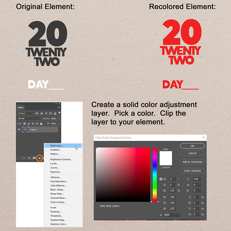
For elements that are solid black or white, you will switch your technique to using a solid color adjustment layer. Then you can pick the color you want and then clip/group that layer to your element. Here’s a few examples from the Title It Trip Planning Date Pack.


Depending on what program you are using, there may be some additional steps, but overall, it is relatively easy to change the color of your scrapbook stash to use on any layout! Below are a couple of video tutorials to give you more details of the different coloring methods. These tutorials are for Photoshop and Photoshop Elements, but a quick search on your software program will give you plenty others to choose from.
For Photoshop, check out this tutorial link for more information about the hue/saturation adjustment, the replace color dialogue, and color replacement tool methods:
https://helpx.adobe.com/photoshop/using/replace-colors.html
For Photoshop, here’s a video link about using the hue/saturation technique:
https://www.youtube.com/watch?v=rSpx2s39Avs
For Photoshop Elements, check out this video link for changing colors using the hue/saturation adjustment:
https://www.youtube.com/watch?v=f1w0UZ0PRUI
For Photoshop Elements, check out this video tutorial for changing the color of multiple objects (like dots in polka dot paper):
https://www.youtube.com/watch?v=c2NxxnceUSM
I hope you give these recoloring techniques a try. Leave a comment if you have any questions or other tips to try.


2 Comments
Leave your reply.